Flight Data Visualization and the Global Scale of Air Travel
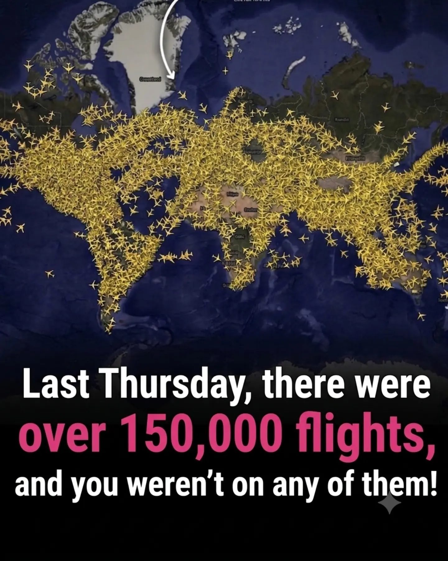
The vast expanse of the world map, dotted with thousands of tiny yellow airplane icons, tells a story of perpetual motion. There are over 150,000 flights in a single day. The dense web of crisscrossing paths underscores the ceaseless nature of air travel, a phenomenon that connects cities, continents, and cultures with remarkable efficiency.
Why This Matters
The scale of air travel is staggering. It's a critical component of modern life, enabling business, tourism, and family connections. Understanding the intricacies of global flight activity offers insights into economic trends, cultural exchanges, and environmental impacts. Flight data visualization makes that complexity accessible, transforming raw numbers into a compelling visual narrative.
Main Discussion
The Global Flight Network
The world map, with its myriad flight paths, reveals the interconnectedness of our planet. Major hubs in North America, Europe, and Asia are hotspots of activity, reflecting the economic and cultural significance of these regions. The concentration of flights in these areas highlights the densely populated zones where commerce and tourism thrive.
Europe: A Hub of Connectivity
Europe is a key player in the global flight network. Its strategic location and well-developed infrastructure make it a vital hub for both international and domestic travel. Cities like London, Paris, and Frankfurt serve as major gateways, connecting travelers to destinations around the world.
Asia: Rapid Growth and High Volume
Asia has seen rapid growth in air travel, driven by robust economic development and a rising middle class. Major airports in cities like Tokyo, Singapore, and Dubai are among the busiest in the world, reflecting the region's importance in global aviation. The high volume of flights in Asia underscores its role as a dynamic center of commerce and tourism.
North America: The Pioneer of Air Travel
North America, with its established aviation infrastructure, remains a pioneer in the industry. Major airports in cities like New York, Los Angeles, and Chicago are critical nodes in the global flight network. The dense flight paths in North America highlight the region's historical and contemporary significance in air travel.
Data Visualization Techniques
Flight data visualization leverages various techniques to depict the scale and complexity of air travel. The use of maps, airplane icons, and path animations provides a clear and engaging representation of global flight activity.
Maps and Geo-Location
Maps serve as the foundation for flight data visualization. They provide a geographical context, allowing viewers to see the distribution of flights across different regions. The use of geo-location data pinpoints the exact routes, making it easier to understand the flow of air traffic.
Icons and Symbols
Airplane icons are a simple yet effective way to represent flights. These small, recognizable symbols make it easy to visualize the density and movement of air travel. The use of different colors or shapes can further enhance the visualization, distinguishing between various types of flights or airlines.
The Human Element
While the numbers and visualizations are impressive, it's essential to consider the human element. Each flight represents journeys and experiences, whether they are for business, leisure, or emotional reunions. The absence of one's own name in the list of flights can spark a sense of wanderlust and a desire to explore.
Practical Tips
If you're inspired to explore the world of flight data visualization, here are some practical tips to get started:
Use Reliable Data Sources
Data accuracy is crucial. Utilize reliable sources like official aviation databases, airport statistics, and flight tracking services. These resources ensure that your visualizations are grounded in solid data.
Choose the Right Tools
Select software that offers robust visualization capabilities. Tools like Tableau, Power BI, or specialized aviation software can help create detailed and interactive maps and charts. These tools often come with built-in features for geo-location and path mapping, making the process more streamlined.
Engage Your Audience
Make your visualizations engaging and interactive. Add animations, hover effects, and intuitive controls to enhance user experience. Allow viewers to filter data by region, time, or type of flight to encourage exploration and discovery.
Important Takeaways
Understanding the scale and complexity of global air travel through flight data visualization offers a unique perspective on connectivity and mobility. From major aviation hubs to the individual journeys, the story of air travel is one of constant motion and profound impact.
Data-Driven Insights
Data visualization can reveal patterns and trends that might not be apparent from raw data. By visualizing flight paths, we can gain insights into economic trends, tourism hotspots, and environmental considerations.
The Emotional Appeal
Data visualization can evoke a sense of wanderlust and curiosity. It reminds us of the vast world out there and the joy of travel. Whether you are planning your next vacation or simply marveling at the scale of global flight activity, the visual representation can be both informative and inspiring.
Future of Flight Data Visualization
As technology advances, the future of flight data visualization holds exciting possibilities. Interactive, real-time maps and augmented reality experiences can provide even more immersive and informative insights. The integration of machine learning and AI can offer predictive analytics, helping us understand future trends and patterns in air travel.
Conclusion
Flight data visualization is a powerful tool for understanding the global scale of air travel. It transforms raw data into a compelling narrative, highlighting the interconnectedness of our world and the significance of aviation in modern life. Whether you're a seasoned traveler or an armchair adventurer, the visual representation of global flight activity offers a unique perspective on the dynamic nature of air travel.
Questions readers ask
How many flights take to the skies each day worldwide?
Over 150,000 flights operate daily, connecting cities, continents, and cultures across the globe. This sheer volume underscores the significance of air travel in maintaining global connectivity.
What are some benefits of visualizing global flight data?
Visualizing global flight data helps make sense of the vast amount of information. It reveals patterns, highlights major hubs, and shows the interconnectedness of cities and continents. This visualization enhances understanding of air travel's role in global connectivity, business, and tourism.
Which regions have the highest concentration of daily air travel routes?
Regions with the highest concentration of daily air travel routes include North America, Europe, and East Asia. These areas have dense networks of flights due to high business activity, extensive tourism, and strong cultural exchanges.
How does air travel impact international business?
Air travel is a lifeline for international business, enabling quick and efficient travel for meetings, conferences, and negotiations. It facilitates the movement of goods and people, driving economic growth and fostering global trade partnerships.
What role does tourism play in global air travel?
Tourism is a major driver of global air travel. Millions of passengers travel to explore new cultures, experience different lifestyles, and enjoy leisure activities. This not only boosts the tourism industry but also supports local economies around the world.
What insights can be gained from analyzing global flight patterns?
Analyzing global flight patterns provides valuable insights into economic trends, cultural exchanges, and environmental impacts. It helps identify key trends in the air travel industry, such as shifts in popular destinations, changes in business travel, and the environmental footprint of aviation.
How does air travel foster cultural exchange?
Air travel promotes cultural exchange by making it easy for people to visit different countries and experience diverse cultures. It facilitates the movement of artists, students, and professionals, leading to an exchange of ideas, traditions, and knowledge. This exchange enriches societies and fosters global understanding.
Related deep dives
Similar reads based on topic and creator.




Recent articles
Fresh deep dives from the latest Reels we unpacked.




Comments
Be the first to comment.