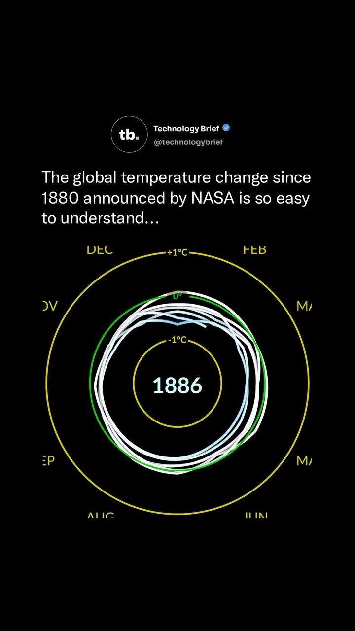
Global Temperature Change: A Visual Journey from 1880 to 2023
Global temperature trends over the past century and a half reveal a clear and alarming pattern of warming. NASA's meticulous tracking of global surface temperatures since 1880 has shown that while the early decades saw temperatures at or below the 1951–1980 average, the trend shifted dramatically starting in the 1980s. By 2023, global surface temperatures hit a record 1.2°C above this baseline, marking the warmest year on record at the time. This data is presented in a compelling visual format that helps to communicate the long-term warming trend to a broad audience. The spiral chart visualization, pioneered by climate scientist Ed Hawkins in 2016, provides a striking way to understand this data.
Why This Matters
The escalating global temperatures have profound implications for ecosystems, weather patterns, and human societies. Understanding this trend is crucial for policymakers, researchers, and the general public to take informed actions. The spiral chart visualization helps to convey this complex data in an accessible and impactful way, making it easier to grasp the significance of the warming trend.
Main Discussion
The Spiral Chart Visualization
The spiral chart, introduced by Ed Hawkins, is a powerful tool for visualizing global temperature change. Each ring in the chart represents a year, with each month positioned around the edge. The color-coding of the months, shifting from blue to red, illustrates the temperature fluctuations over time. When the rings stack into a 3D shape and then flatten into a single timeline, the visual impact is immediate. The blue years, indicating cooler temperatures, cluster at the bottom, while the red years, signifying warmer temperatures, crowd the top. This visual representation makes it easy to see the increasing trend of global temperature change.
Key Milestones in Global Temperature Change
The visualization highlights several key milestones in the global temperature trend. For instance, 1882 marks a point where temperatures were relatively stable and close to the baseline. By 1944, there was a noticeable shift, but it was not until the 1980s that the monthly figures consistently rose above the baseline. This trend continued, reaching a critical point in 2000, and by 2023, the global surface temperatures had increased by 1.2°C above the 1951–1980 average, marking the warmest year on record at the time. This consistent upward trend underscores the urgency of addressing climate change.
Practical Tips
Understanding the Spiral Chart
To fully appreciate the spiral chart, it helps to focus on a few key aspects. First, the color gradient from blue to red is essential. Blue indicates cooler temperatures, while red signifies warmer temperatures. The transition from blue to red over the years visually communicates the warming trend. Additionally, the concentric circles representing each year help to break down the data into manageable chunks, making it easier to follow the temperature fluctuations over time.
Interpreting the Data
When looking at the spiral chart, pay attention to the clustering of colors. The blue years at the bottom represent periods of relative stability or slight cooling, while the red years at the top indicate significant warming. The gap between the blue and red years spans exactly one degree Celsius, emphasizing the magnitude of the temperature change.
Important Takeaways
The spiral chart visualization provides a clear and compelling way to understand the long-term warming trend. Key takeaways from this visualization include:
- The global temperature trend has shown a consistent upward trajectory since the 1880s, with significant acceleration in the 1980s.
- The increasing temperature anomalies are highlighted by the spiral chart, where the color shift from blue to red clearly shows the rising temperatures.
- The gap between the coolest and warmest years spans exactly one degree Celsius, underscoring the magnitude of the temperature change.
- The visualization makes complex data accessible, helping a broader audience to grasp the implications of global warming.
Conclusion
The global temperature change visualization from NASA, presented in a spiral chart format, offers a powerful way to understand the escalating trend of global warming. From the consistent upward trajectory since the 1880s to the significant acceleration in the 1980s, the visualization provides clear insights into the magnitude and urgency of this issue. By making complex data accessible, it helps to raise awareness and prompt informed action. This visualization is a valuable tool for communicating the long-term warming trend to general audiences, emphasizing the need for collective efforts to mitigate the impacts of climate change.
Questions readers ask
What does the NASA visualization reveal about global warming since 1880?
The NASA visualization demonstrates a clear and alarming increase in global temperatures, with a notable shift in the warming trend starting in the 1980s. By 2023, the data shows that global surface temperatures reached 1.2°C above the 1951-1980 average, making it the warmest year on record, up to that point.
How does the spiral chart help in understanding global warming?
The spiral chart, developed by climate scientist Ed Hawkins, provides an intuitive and visually striking way to grasp the warming trend. It plots each year’s global temperature on a spiral, making it easy to see the progression of rising temperatures over time. This visual aid helps to communicate the long-term warming trend effectively to a wide audience.
What are the key findings from NASA's global temperature data since 1880?
NASA's data shows that from the 1980s, global surface temperatures began to rise more sharply. By 2023, the data indicated a 1.2°C increase in global surface temperatures compared to the 1951-1980 average.
What does NASA use to track global warming trends?
NASA meticulously tracks global surface temperatures using a combination of satellite data, weather stations, and other meteorological measurements. This comprehensive data collection allows for the creation of global temperature records that date back to 1880.
How is the monthly global temperature change from 1880 to 2023 visualized?
The monthly global temperature change is visualized in a spiral chart that begins in 1880. Each year is represented by a full circle, with each month plotted accordingly, showing a clear upward trend in temperatures over the years.
What is the significance of the year 1980 in the global warming trend?
The year 1980 marks a significant turning point in the global warming trend. Prior to this, global temperatures were mostly at or below the 1951-1980 average. However, starting in the 1980s, temperatures began to rise sharply, indicating a major shift in the global climate.
How does the 2023 data compare to previous years in terms of global temperature?
In 2023, global surface temperatures reached a record high of 1.2°C above the 1951-1980 average. This makes 2023 the warmest year on record, surpassing previous highs and highlighting an accelerating warming trend over the past few decades.
Related deep dives
Similar reads based on topic and creator.



Recent articles
Fresh deep dives from the latest Reels we unpacked.




Comments
Be the first to comment.