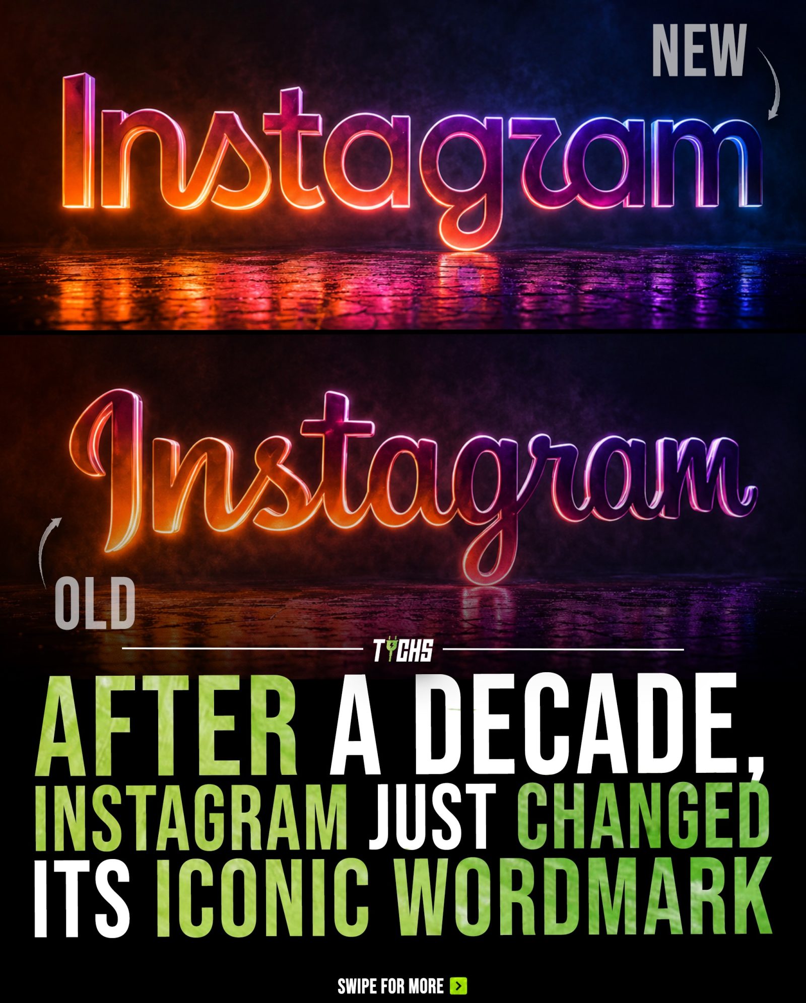
Instagram Wordmark Evolution: After a Decade, a New Look
Instagram's iconic wordmark has undergone a significant change, marking the first update in a decade. The shift from the familiar cursive lettering to a hybrid of script and print brings a modern, cleaner appearance while retaining the brand’s original visual character. Instagram head Adam Mosseri emphasized that the redesign aims to refresh the look while maintaining the brand's simplicity and craft.
Why This Matters
Branding is a crucial aspect of any social media platform, and a logo is often the first visual element that users associate with a brand. The redesign of the Instagram wordmark is more than just a cosmetic change; it reflects the platform's evolution and adapts to the changing landscape of visual communication.
The Evolution of the Instagram Wordmark
The Old Wordmark
For over a decade, Instagram's wordmark featured a distinctive cursive font that became instantly recognizable. The elegant, flowing script was a staple of the platform's visual identity, appearing consistently across all user interfaces and marketing materials. This design choice was instrumental in establishing Instagram as a unique and accessible platform.
The New Wordmark
The new wordmark introduces a hybrid of script and print, blending the familiarity of the original design with a more modern aesthetic. The shift to a cleaner, more streamlined look is a deliberate choice to align with the current trends in design and technology. The new design still retains some of the original visual character, ensuring that the transition is not too jarring for long-time users.
The Design Process
The redesign process involved a careful balance between retaining the brand's original visual character and introducing a modern, clean appearance. Adam Mosseri, the head of Instagram, highlighted the importance of simplicity and craft in the new design. The new wordmark was created to be more versatile, making it easier to adapt to different visual contexts while maintaining the brand's recognizable identity.
User Reception and Debate
The update to the wordmark has sparked a lively debate among users. Some appreciate the cleaner, more modern look, while others prefer the original cursive design. The change has prompted discussions about the evolution of branding and the significance of visual elements in user experience. Regardless of the individual preferences, the new wordmark represents a significant shift in Instagram's visual identity, marking a new chapter in the platform's history.
Practical Tips
When considering a brand redesign, here are some practical tips to help guide the process:
- Understand Your Brand: Start by understanding the core values and visual identity of your brand. Ensure that any changes align with these foundational elements.
- Evaluate User Feedback: Look at how users interact with your brand and gather feedback on potential changes. This can provide valuable insights into what resonates with your audience.
- Test New Designs: Before rolling out a new design, test it in different contexts to see how it performs. Gather feedback from a diverse group of users to ensure it has broad appeal.
- Maintain Consistency: Even with a new design, it's essential to maintain consistency in your branding. Ensure that the new wordmark or logo is used uniformly across all platforms and materials.
- Communicate the Changes: When introducing a new design, clearly communicate the reasons behind the change and how it benefits users. This can help manage user expectations and reduce resistance to the new look.
Important Takeaways
The evolution of the Instagram wordmark serves as a reminder of the importance of visual branding. A well-designed wordmark can significantly impact user perception and engagement. Here are the key takeaways from the redesign:
- Visual Identity Matters: A strong visual identity is crucial for brand recognition and user engagement.
- Balancing Tradition and Innovation: Successful rebranding involves balancing the familiar with the new, ensuring a smooth transition for users.
- User Feedback is Valuable: Engaging with users and gathering their feedback can provide insights into how a new design will be received.
- Simplicity and Craft: A clean, modern design can enhance a brand's appeal and adaptability.
Conclusion
The new Instagram wordmark represents a significant shift in the platform's visual identity, bringing a fresh look while retaining its original character. Whether you prefer the old or new design, it's clear that the change is a thoughtful step towards modernizing the brand. As Instagram continues to evolve, its visual identity will adapt to meet the changing needs and preferences of its users.
Questions readers ask
What inspired the recent change in Instagram's wordmark?
The recent update to Instagram's wordmark was inspired by the platform's evolution and the need to adapt to the changing landscape of visual communication. The new design aims to refresh the brand's look while maintaining its core visual character and simplicity.
How does the new Instagram wordmark differ from the previous design?
The new Instagram wordmark has transitioned from a classic cursive font to a modern hybrid of script and print, marking a significant departure from the previous design. This change brings a cleaner, more contemporary appearance while retaining the brand’s original visual character.
Why is the Instagram wordmark update significant?
The update is significant because it reflects a decade of change and growth in the platform. It also represents the importance of branding in social media, as the logo is often the first visual element users associate with the brand.
What does the new wordmark signify for Instagram's future?
The new wordmark signifies a fresh start and a commitment to evolving with the times. It suggests a focus on modern, clean aesthetics and an intention to stay relevant in the dynamic world of visual communication.
Will the new wordmark affect the user experience on Instagram?
The new wordmark itself won't directly affect the user experience. The change is primarily visual, aimed at refreshing the brand's appearance. However, it may enhance user perception and engagement over time by signaling that Instagram is continually evolving.
How does the new wordmark reflect Instagram’s brand identity?
The new wordmark maintains the brand’s simplicity and craft while introducing a modern, cleaner look. This balance reflects Instagram’s commitment to its core identity while embracing contemporary design trends, ensuring the brand remains recognizable and appealing to its users.
What are the key changes in the new hybrid font of Instagram's wordmark?
The hybrid font combines elements of script and print, resulting in a more structured and modern appearance. This contrasts with the previous cursive font, offering a fresh visual identity while preserving the brand’s familiar aesthetic.
Recent articles
Fresh deep dives from the latest Reels we unpacked.




Comments
Be the first to comment.