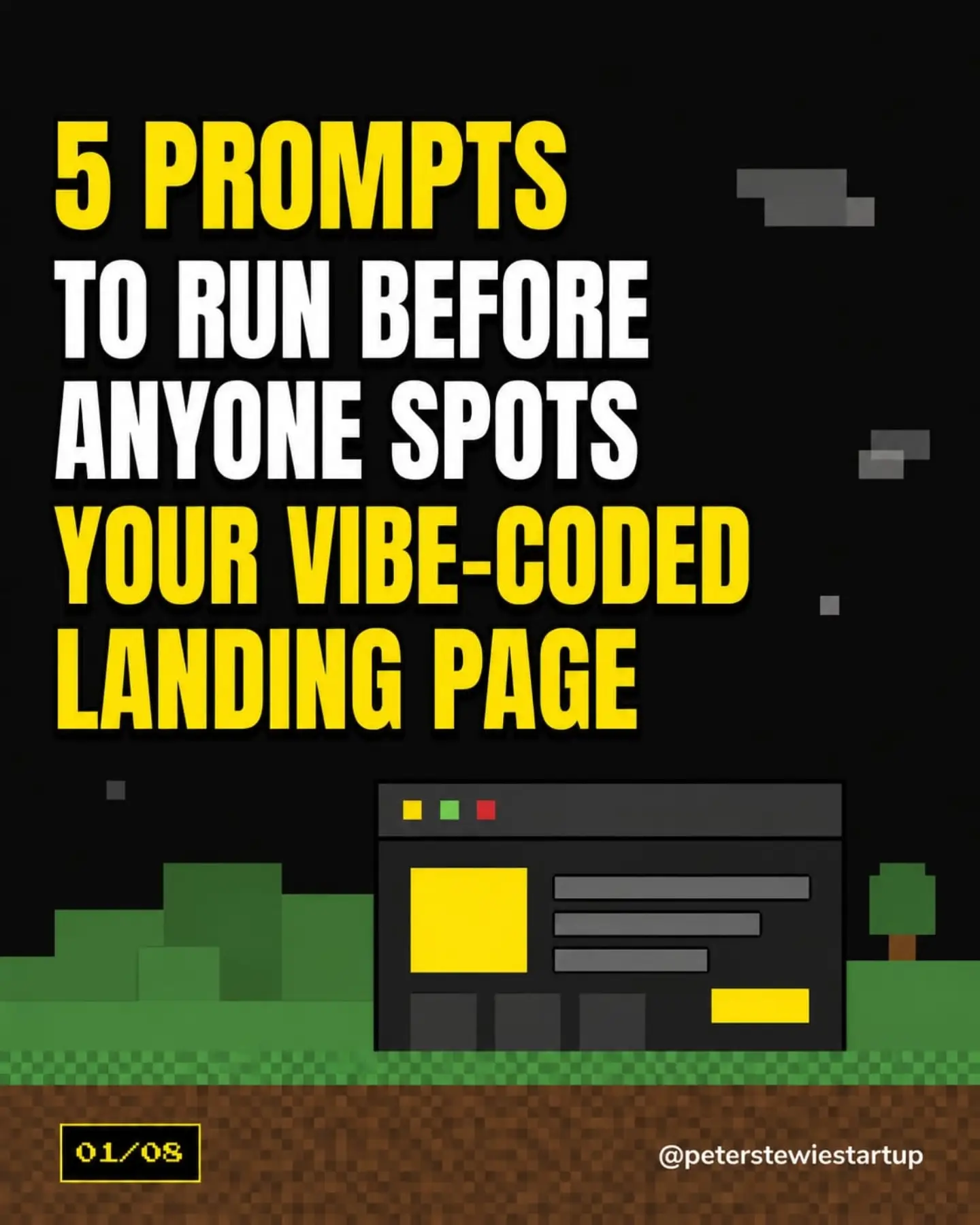
Five Prompts To Fix A "Vibe-Coded" Landing Page
The landing page is supposed to be a salesperson, pitching the product. But if all those pitches look like they came out of the same AI defaults factory, users might not get the right message. This is the vibe-coded landing page problem, according to Peter Stewart of Peterstewiestartup, in a recent reel. Landing pages these days are often created through AI that relies on generic design choices. Stewart points out the overuse of purple gradients, glassmorphism cards, generic feature icons, and cramped typography. These design defaults are so ubiquitous in AI-generated content that users easily recognize the AI rather than the product. But there are better options for getting the product's individuality and premium feel across.
Aim for Uniqueness, Aim for Premium
Landing pages are the front door to digital products. But imagine a row of identical bland doors. Users might never notice any of them. Still, AI defaults create a uniform appearance. The ease of integrating AI-generated design might make sense to companies, but to users, it screams generic. Consumers are spoiled by the real thing. They can spot AI defaults a mile away, and the vibe isn't good. Peter Stewart’s solution is a series of specific prompts to avoid And they’re grounded in what users are already using to make their own decisions on what’s real and what’s not. Stewart posits that actual companies and their human designers have somehow escaped the AI defaults’ blandness. But a landing page built with AI defaults lacks the authenticity of real companies.
First, Ditch The Gradients and Glassmorphism
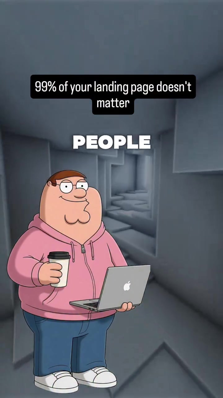
The first step in fixing a vibe-coded landing page is ruthlessly eliminating the ubiquity of undesirable features. Purple gradients and glassmorphism effects are prevalent in AI defaults, but they don’t signal quality and uniqueness. “Gradients don’t read as premium anymore,” Stewart said. “Every app shipped one this week.” In contrast, a simple flat color can evoke simplicity and reliability. It’s less loud, which makes users focus on the content, not the design. Peter Stewart advises a single flat color to replace the gradient and glassmorphism effect. The change makes the page look more refined.
**"Replace Gradient, And What To Use"
Stewart suggests using a single, flat color to replace gradients and glassmorphism. Gradients and glassmorphism are outdated or are overused in AI-generated designs, so using them makes a landing page look unprofessional. The alternative is flat color. Flat design has been trending, and flat colors look modern, clean, and professional. Stewart says that flat colors bolster a design for several reasons:
- The crisp neatness of flat colors causes no visual distractions.
- Flat colors look good on any device.
- Flat colors are easy to adjust to brand colors.
Rethink The Typography
However, the problems with AI-generated landing pages don’t stop at the gradients and glassmorphism. When it comes to typography, the default settings can result in cramped text that’s difficult to read. Users are likely to get cranky quickly if they can’t focus. Peter Stewart advises picking one real font and fixing the line height and spacing. A single, creative font improves readability and enhances the brand’s identity.
Consistency Counts
The human eye prefers harmony. Since AI defaults create a patchwork of random design choices, brands need to make up for it by ensuring that their landing pages have a consistent look and feel from top to bottom. Peter Stewart advises eliminating purple backgrounds and replacing them with a flat color. Removing purple backgrounds gives the page a more professional look, since purple is a non-traditional color for professional branding.
Build Larger and Better
Another way to make the landing page feel more authentic is to cut down on the AI defaults and add the unique one-two punch of company branding. Stewart advises building pages that look like those of real companies.
Create Something Worth Seeing
The contrasting effects—the flat color with real typography—draw users’ eyes to the content. It keeps them reading and clicking. The branding calmness makes users feel that the company is professional and will deliver on its promises. Stewart says these choices make the page more readable. The text is easier to see and focus on, improving the customer experience. But Stewart doesn’t stop there. He wants landing pages to feel like they’re part of a bigger company. When Stewart says “Build pages that look like a real company,” he’s saying to forget the AI defaults and stop trying to make the page look like it was created by AI. Focus on the brand, not the design elements. Make sure the landing page looks professional and unique. If you’re ready to ditch the AI defaults and make a landing page that makes sense, it’s time to get rid of the vibe-coding. Check out the five prompts Peter Stewart offers, and get started building a better, more professional, and unique landing page.
Purge The AI Defaults
It’s important to work through the five prompts before you release a new landing page. They’re counterintuitive, given the vibe-coded landing page. That’s because each one emphasizes one consistent and simple element, but this will make the landing page stand out.
- Reset Visuals Reset any purple backgrounds, gradients, and glassmorphism.
- Select A Real Font Replace the AI defaults with a font that is not the default.
- Line Height Increasing the line height increases the reading space.
- Spacing Adjust the spacing between the lines of the text
- Eliminate the Generic Icons Replace any off-brand icons that come with AI defaults. It’s the AI defaults that are the problem, not the AI itself. You can still use the AI to help the designs. However, it’s crucial to override the defaults and replace them with a user-friendly set of prompts. These prompts will help create a more user-friendly, professional landing page.
Questions readers ask
What exactly is a 'vibe-coded' landing page, and why is it a problem?
A 'vibe-coded' landing page is one that relies heavily on generic design elements commonly found in AI-generated content, like purple gradients and glassmorphism. The problem is that these design choices make the page look generic and unoriginal, which can turn users off and prevent them from engaging with the product. Users can easily spot these AI defaults, and it undermines the authenticity of the brand.
How did Peter Stewart suggest replacing gradients and glassmorphism effects on a landing page?
Peter Stewart recommends ditching gradients and glassmorphism in favor of a single, flat color. This change can make the page look more refined and professional, and it helps users focus on the content rather than the design.
What are the benefits of using flat colors on a landing page, according to Stewart?
Stewart points out that flat colors are modern, clean, and professional. They also look good on any device and are easy to adjust to match brand colors. Plus, they don't cause visual distractions, allowing users to focus more on the content.
What specific design elements does Stewart call out as overused in AI-generated landing pages?
Stewart mentions purple gradients, glassmorphism effects, generic feature icons, and cramped typography as design elements that are overused in AI-generated landing pages. These elements can make a landing page feel generic and unoriginal.
Why does Stewart advise against using gradients on landing pages?
Stewart advises against using gradients because they are overused and no longer read as premium. Gradients can make a landing page look unprofessional and outdated, as they are so common in AI-generated designs. Instead, he suggests using a single, flat color.
Related deep dives
Similar reads based on topic and creator.
Recent articles
Fresh deep dives from the latest Reels we unpacked.
Comments
Be the first to comment.