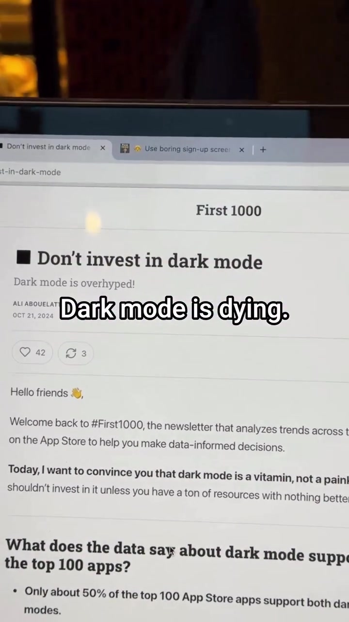
Dark mode, once hailed as a modern design essential, is on the outs. Apps notorious for A/B testing, such as Facebook and LinkedIn, have started turning off dark mode by default. When a feature costs too much to maintain and implement, the value becomes questionable. Dark mode only exists in 51% of the top 100 App Store apps; half of these apps require users to navigate through settings to enable dark mode. Some apps, like Amazon, Airbnb, Venmo, and Temu, do not support dark mode. Why this shift? It costs more to maintain and implement than it's worth. Amazon, Airbnb, Venmo, and Temu all opt to avoid it. In fact, 12% of apps that support dark mode force users to toggle it on in settings, suggesting a reluctance to fully commit to the feature. The trend leaves only about 50% of the top apps offer dual-mode support. Little wonder that tech industry observers like Ali Abouelatta are sounding the death knell.
The death of dark mode
Dark mode made its mark as a nighttime mode. It offered an easy way to save eye strain. But in the tech world, nothing is permanent. The rise of dark mode came from its aesthetic appeal; many apps rushed to add it to stay trendy. Now it's a different story: 12% of the top 100 apps require users to manually enable dark mode in settings, and the number of apps ditching support is growing. When the value of dark mode is no longer worth the cost to maintain, it's game over.
The legacy of dark mode as a trend
Dark mode's rise was linked to aesthetic trends. When smartphones became widespread and people started spending hours on their devices, it was one of the first features to become popular. It promised a lot, like saving energy, reducing eye strain, and looking cool. Many app developers wanted to give users what they wanted, so they added this as an important feature. From this perspective, dark mode is a manifestation of an a A/B testing, a popular method for comparing two versions of a single variable with different design elements. Why is dark mode losing steam? In a world where user experience is paramount, dark mode is no longer the allure it once was. It has become less about user preference and more about the cost associated with it and the impact on conversions. It’s not just about the visual appeal anymore; it comes down to data and metrics — simplicity beats aesthetics — simplicity beats complexity—every time. The designs that bring in more customers are straightforward and uncluttered. There are fewer distractions, and in return, the conversion rate increases. For instance, a registration page with a video background might look more appealing, but it could also serve as a distraction. It doesn't promote clarity.
Shifting priorities and user expectations
What does this mean for the future of design? Designers and developers are focusing on creating the best user experience. In today's world, an app without dark mode is nothing new — it is a feature that is easily overlooked. The recent news shows that some of the most popular apps on the market don’t even support dark mode. With the cost of maintaining and implementing dark mode outweighing the benefits, it's no surprise that more apps are likely to follow suit.
The costs of dual-mode apps
Apps that offer both light and dark modes need to put in more effort to maintain both; they require different coding, design elements, and images. Additionally, different images are required, and the design layout needs to be altered to ensure readability under different lighting. Apps might have to employ more developers and designers, increasing the workload and cost. This additional effort, combined with the potential lack of user preference, can make maintaining dark mode seem less worthwhile.
Dark mode’s impact on conversions
Apps with dark mode aren’t necessarily selling better. Designers have concluded that simple designs that are easy to understand and navigate are more effective. In account creation flows, for instance, a simple, straightforward design is favored over a design that looks good but might confuse the user. An aesthetically superior design could confuse users, leading to lower conversion rates.
The case for simplicity
If an app does not support dark mode, it saves resources. Without the need to maintain both modes, designers can prioritize elements that actually affect user experience and conversion. It’s not just about aesthetics, it’s about how users respond to the design. Designs that are simple and straightforward are more likely to convert users and have a positive impact on sales. If the design is too complex or confusing, users might not complete the action.
Choosing the right design for your app
Dark mode can be important and aesthetically pleasing, but it's essential to understand the cost and its impact on the user experience and your business. If dark mode is something users don't care about, it can be just a waste of resources. Make sure to analyze what your target audience is looking for. Consider prioritizing user experience and data-driven design choices.
- Assess your audience: If a large portion of your users doesn’t care about dark mode, it might not be worth the investment. Use A/B testing to determine which design resonates better with your audience
- Focus on usability: Ensure that your app is user-friendly, easy to navigate, and enjoyable. Aesthetics are important, but they should never compromise functionality.
- Analyze metrics: Track the performance of your app, and see how different design decisions impact user behavior and conversions.
Know the future
The future of design is leaning towards simplicity. Apps are focusing on user experience and how they can convert users into customers. Dark mode had its moment, but now, it’s costing more than it's worth. With that, designers are emphasizing other design aspects, like the user experience.
Related deep dives
Similar reads based on topic and creator.



Recent articles
Fresh deep dives from the latest Reels we unpacked.


Comments
Be the first to comment.